Sorry, guys! During system maintenance, some functions like comment are unavailable.
What covers make you not want to read it
like when you see this cover you go oohhh I don't want to read it LMAOO ik the saying "don't judge the book by it's cover" but when it's a g+ cup woman in a bikini with her legs spread out it's just hard not to judge
ANW for me, it's those romance manhwa/hua/manga covers where the mc is so exaggeratedly uwu-fied with big teary eyes, and the ml looking like a typial domineering ceo twice their size (AND IT OBVIOUSLY LOOKS LIKE THEY'RE GONNA HAVE A TOXIC RELATIONSHIP)
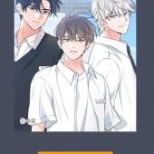
Anything with more than 2 characters on the cover. If it is family friendly/slice of life, I can understand. Anything else. Nope.
Examples. I havent read these so idk what they're about but just know I'm not touching these. Also cropped out they titles cuz I ain't giving free promotion 1 reply
if i see a furry/or animal on the cover hugging/licking/sexually intimate with a human dawg i hate beastiality so damn much, doesn't matter if it's able to now stand on its two hindlegs and fuck a human reply
The basic or generic korean artstyle used for every drama manhwa. They are so boring and have little plot. Its always just smut at first then “love”. Usually cute uke, big and ugly seme 1 reply
I hate the ones with very scandalous women on the cover being groped by some plain ass mf. Like vro it’s jarring to look at and what if my mom was behind me? Especially when I’m not even tryna read anything sexual. And also the BL where there is an immense size difference between the two characters on the cover, like dude why does one of them l...... 1 reply
I always avoid ones where the cover is overly like sexy/suggestive, but actually whenever I end up reading them they are usually pretty entertaining LOL
I also typically won't read any yaois where the cover features an effeminate/particularly small and cute or waifish looking uke.
Also anything with art that is not completely to my tastes.
Aaan...... reply