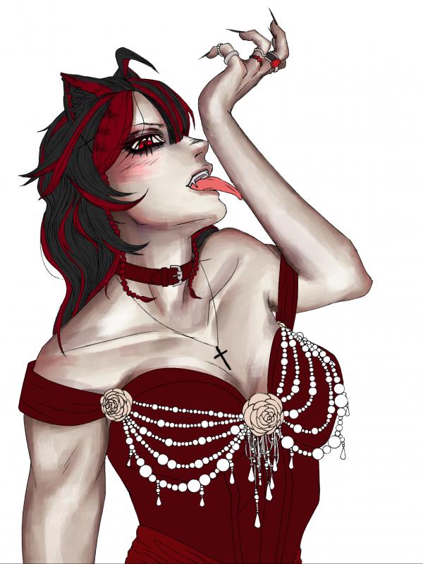
it looks good! doesn't look boring, just unfinished. you can see in the reference photo that the artist doesn't use a simple darker hue (brown) to shade the skin, but warm tones like red and pink. depending on your light source you should be shading with either cooler tones or warmer tones, not tan/brown. additionally since the color of her dress is red, i'd rec going in there and adding warmer tones to show the light bouncing off the dress onto her skin.
you can also see in the reference that the shading of the skin is more textured. though i can see that yours is textured as well, your brush stokes are very long, compared to the almost dotted strokes of the reference photo. her face looks flat only due to the lack of shading around her cheeks. i would suggest finding a reference for the exact angle of the face or taking your own. of course the location of the light source is also important. you can also temporarily change your drawing into grey scale in order to estimate your light/dark values.
on another note, if you really want to learn from this reference photo in particular, i would suggest doing a photo study, which is essentially just trying to copy it--shape, value, techique, etc. this lets you actually observe and study how the artist rendered their drawing (specifically how they shaded the skin) instead of having you apply the techniques that you haven't fully learned yet onto one of your own drawings. does that make sense? one of my favorite study methods is splitting the canvas in half and attemping to do only on side. there are a ton of tutorials on youtube. good luck!!
Tysm!! I’ve done photo studies once before though and I absolutely hate it they’re so boring to do, which is why I just copy shading like this and just hope for the best
Hrmmmm, the original reminds me of a lot of subsurface scattering. I would look at some lighting references that includes subsurface scattering to find one similar to the original. That way you’ll have an easier time knowing where to place the more saturated reds and purples. If all else fails just turn the skin B&W and gradient map it.
the skin looks way too grayish add more colors like blue, red, yellow blend it well I recommend learning color theory, also I think the head looks a bit off. I mean you should make it a bit bigger because the back looks a little too flat ;3
The shadow looks a bit dull compared to the ref. Personally I think you can eyedrop the colors from the ref for practice but my rule of thumb is always have
1 main color base 1 saturated red 1 desaturated red 1 blues for shadow
the skin looks grayish bc it's very desaturated compared to the dress and hair either make the other stuff grayer or add more saturated tones to the skin
2. you have a dark red dress on a pale skin and you are giving the skin a sickish pale look with a similar dark red. the skin which should contrast your dress is now blending into your dress. try a pinker/lighter red because right now the only thing that's remotely contrasting is her tongue. similarly her skin tone is bordering blackish-brown.
3. I can see your brushstrokes, which is fine but it's clear you don't intend on me seeing your brushstrokes since the other parts of the drawing don't have said brushstrokes. I don't know how to fix this on drawing software.
4. your anatomy is wrong, which will inadvertently lead you to drawing the light wrong, it's like a joint that's been popped out. I also don't know how to fix it, but I can tell your anatomy is going to fuck shit up because you have muscles bulging in places where I don't think they should be bulging.
granted I know shit about drawing, but that's what it feels to me.
The only part of the drawing rendered is the skin so that’s why you don’t see any other brush strokes on the other part of the skin. This is also a commission for someone and this is the color pallet they wanted so I unfortunately cant change it. The anatomy is shitty but I don’t feel like changing all that anymore Im only focusing on the rendering now. Im also horrible at lighting which is why I need help T-T
The only part of the drawing rendered is the skin so that’s why you don’t see any other brush strokes on the other part of the skin. This is also a commission for someone and this is the color pallet they w... Cruchy_rollers
The skin doesn't look bad, the shading is just pretty greyish which gives it this stylized vibe like something you would see in an old newspaper. If you want the skin to look more natural tho, try shading with a warmer color (like a more orangy brown). If you wanna get real fancy, you could also add a color to the areas that are hit by the light (because light usually isn't white but filtered due to clouds, being reflected off something etc). Also, not to be mean, but her left upper arm is a bit too short, and like Pesky33 said, the upper eyelid is a bit too high. Just for future reference. ヾ(❀╹◡╹)ノ~
Yeah ik I had trouble with the arm and getting the exact pose I wanted T-T this was just the best I could do sadly. Im trying to keep the shading cold since shes a vampire but yeah it just look grey so I’ll try some warmer tones!!!
Hiya ! I think you should use a smudge tool for the shadows to make them softer bc you have a lot of hard edges, you should try to balance the two ! And I feel like you used the skin color but just darker with some touch of red for the shadows, maybe try to use more different hues :) (there are some great videos too on painting skin tones on yt) Great job keep going <3
For the green one though, it kinda just made her look green… and the eye part is bcs Im not going for realism!!! It’s more of a stylistic choice to make it the shape it is(frontwards facing) and not have the same physics as real eyes^^
The lighting of the skin is pretty good, it’s the colour that could be the issue? I was always taught to do a layer of Green tones under the flesh tones to make it glow, but no one really seems to do that much on digital art. Maybe try doing that? (I don’t really do colour stuff any more so can’t be much help, but I definitely think it’s the colour and not your shading


Messages
Gang https://www.mangago.me/thing/about/898012/
it looks good! doesn't look boring, just unfinished. you can see in the reference photo that the artist doesn't use a simple darker hue (brown) to shade the skin, but warm tones like red and pink. depending on your light source you should be shading with either cooler tones or warmer tones, not tan/brown. additionally since the color of her dress is red, i'd rec going in there and adding warmer tones to show the light bouncing off the dress onto her skin.
you can also see in the reference that the shading of the skin is more textured. though i can see that yours is textured as well, your brush stokes are very long, compared to the almost dotted strokes of the reference photo. her face looks flat only due to the lack of shading around her cheeks. i would suggest finding a reference for the exact angle of the face or taking your own. of course the location of the light source is also important. you can also temporarily change your drawing into grey scale in order to estimate your light/dark values.
on another note, if you really want to learn from this reference photo in particular, i would suggest doing a photo study, which is essentially just trying to copy it--shape, value, techique, etc. this lets you actually observe and study how the artist rendered their drawing (specifically how they shaded the skin) instead of having you apply the techniques that you haven't fully learned yet onto one of your own drawings. does that make sense? one of my favorite study methods is splitting the canvas in half and attemping to do only on side. there are a ton of tutorials on youtube. good luck!!
Tysm!! I’ve done photo studies once before though and I absolutely hate it they’re so boring to do, which is why I just copy shading like this and just hope for the best
Hrmmmm, the original reminds me of a lot of subsurface scattering. I would look at some lighting references that includes subsurface scattering to find one similar to the original. That way you’ll have an easier time knowing where to place the more saturated reds and purples. If all else fails just turn the skin B&W and gradient map it.
the skin looks way too grayish add more colors like blue, red, yellow blend it well I recommend learning color theory, also I think the head looks a bit off. I mean you should make it a bit bigger because the back looks a little too flat ;3
I’ll add a bit more hair then cause ur the second person to say this
keep up the good work though :) This is a very lovely drawing ヾ(❀╹◡╹)ノ~
The shadow looks a bit dull compared to the ref. Personally I think you can eyedrop the colors from the ref for practice but my rule of thumb is always have
1 main color base
1 saturated red
1 desaturated red
1 blues for shadow
Yes ty!!^^
the skin looks grayish bc it's very desaturated compared to the dress and hair
either make the other stuff grayer or add more saturated tones to the skin
I’ll try making it more saturated but I don’t want it to be too colorful since it’s supposed to be pale ish
my belief in the order of why the skin looks odd:
1 > 4 > 2 > 3
1. you don't have a single light source.
2. you have a dark red dress on a pale skin and you are giving the skin a sickish pale look with a similar dark red. the skin which should contrast your dress is now blending into your dress. try a pinker/lighter red because right now the only thing that's remotely contrasting is her tongue. similarly her skin tone is bordering blackish-brown.
3. I can see your brushstrokes, which is fine but it's clear you don't intend on me seeing your brushstrokes since the other parts of the drawing don't have said brushstrokes. I don't know how to fix this on drawing software.
4. your anatomy is wrong, which will inadvertently lead you to drawing the light wrong, it's like a joint that's been popped out. I also don't know how to fix it, but I can tell your anatomy is going to fuck shit up because you have muscles bulging in places where I don't think they should be bulging.
granted I know shit about drawing, but that's what it feels to me.
hope it helps.
The only part of the drawing rendered is the skin so that’s why you don’t see any other brush strokes on the other part of the skin. This is also a commission for someone and this is the color pallet they wanted so I unfortunately cant change it. The anatomy is shitty but I don’t feel like changing all that anymore Im only focusing on the rendering now. Im also horrible at lighting which is why I need help T-T
*Other parts besides the skin
The skin doesn't look bad, the shading is just pretty greyish which gives it this stylized vibe like something you would see in an old newspaper.
If you want the skin to look more natural tho, try shading with a warmer color (like a more orangy brown). If you wanna get real fancy, you could also add a color to the areas that are hit by the light (because light usually isn't white but filtered due to clouds, being reflected off something etc).
Also, not to be mean, but her left upper arm is a bit too short, and like Pesky33 said, the upper eyelid is a bit too high. Just for future reference. ヾ(❀╹◡╹)ノ~
Yeah ik I had trouble with the arm and getting the exact pose I wanted T-T this was just the best I could do sadly. Im trying to keep the shading cold since shes a vampire but yeah it just look grey so I’ll try some warmer tones!!!
Hiya ! I think you should use a smudge tool for the shadows to make them softer bc you have a lot of hard edges, you should try to balance the two !
And I feel like you used the skin color but just darker with some touch of red for the shadows, maybe try to use more different hues :)
(there are some great videos too on painting skin tones on yt)
Great job keep going <3
Ok ty!!! I’ll try adding more color
GIRL YOU HAVE ME BLOCKED I can’t respond
For the green one though, it kinda just made her look green… and the eye part is bcs Im not going for realism!!! It’s more of a stylistic choice to make it the shape it is(frontwards facing) and not have the same physics as real eyes^^
The lighting of the skin is pretty good, it’s the colour that could be the issue? I was always taught to do a layer of Green tones under the flesh tones to make it glow, but no one really seems to do that much on digital art. Maybe try doing that? (I don’t really do colour stuff any more so can’t be much help, but I definitely think it’s the colour and not your shading
Also friendly advice - there should never be white above the iris in eyes. If someone is looking down, lower their eyelid as well as the iris