It took me forever to find how to do this again. Anyways, here are my suggestions for better anatomy (mostly). The order of the numbers doesn't say anything about importance, I just had to start somewhere.
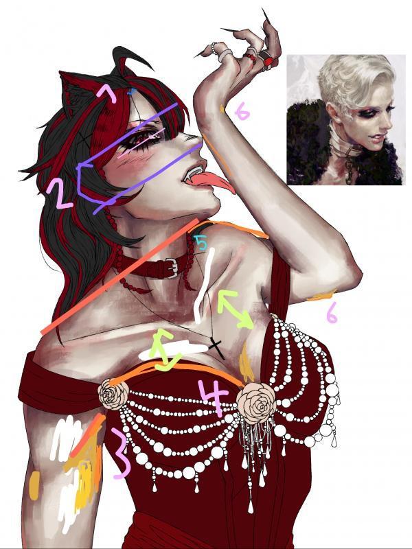
1) I suggest adding a little hairline because rn it looks a bit like she's wearing a wig.
2) The way the eye is tilted doesn't quite match the way the head is tilted. I added the pink line to show the direction of the head and how it should be tilted. I believe rotating it a little should work here, so you don't have to draw the whole eye again. Btw good job on bringing the eyelid down a bit so there's less white above the iris. Oh, and I only drew in the ear as a guideline.
3) There's only one muscle on the top of the arm but your shading made it look like there are two. To fix this, you could bring up the line on the inside of the arm and bring down the shading you had in the middle of the arm and combine them into one.
4) I already talked about the boob shading. Here is the visualization.
5) If you bring up the collarbone, it makes the upper arm look longer. Also, you should straighten out the line on top of the upper arm, there is usually no dent there. Oh and I added the darker orange line to show the line of the shoulders (which is following the tilt of the head, nice).
6) At her wrist, the line art digs a little in the arm, which It shouldn't. And at her elbow, we should be able to see the other little bone from this angle (the one that hurts like hell when you bump it on anything).
I did this on my phone and used the colors I had available. So uhh just take it as a reference for brighter and darker areas.
Also the last pic you added, with the purple shadows...... I know you did it because someone suggested colder shadows for more contrast with the dress and hair but honestly that wasn't a good suggestion. In the version I drew on, your colors look cohesive and the shading works really well but the purple you added kinda destroyed it. Warm highlights/cold shadows doesn't fit your drawing. If you wanted to add a contrast between highlights and shadows, I suggest using cold highlights instead (adding a blueish tint to the lightest areas with soft light (or hard light depending on your preference)). If you do keep the purple in the shadows, then you need to use it on the dress as well. Iirc your shading on the dress was pretty warm.
Honestly, if you just keep to the color palette from the reference, you're good. It looks really good even tho there aren't any cold shadows (or any contrast between warm/cold colors). The whole contrast thing is a style choice anyways, and art still looks good without it.
Alright that's it for my yappatron. Sorry I kinda wrote a novel there. ( ̄∇ ̄")
Oh, and if you have any questions, just ask :)

Messages
Thank you sm for this!! People told me to play with the contrast and stuff so I added the purples and stuff and asked which one looked better and a lot of people like it with them so ig thats more a matter of opinion lmao. I’ll go fix the shading though ty!! And I didn’t bring the eyelid down, I just shaded it which is why it looked weird cause it had no shading
Ooohhh thats why i feel weird with pic... its the eyeee!!! (≧∀≦)
That’s also likely the reason why lower third looks so long
Lower third??